VHS vs CRT Photo Effect: What’s the Difference?
VHS and CRT are used almost interchangeably to describe "retro analog" photo edits, but they come from two completely different pieces of hardware. One is a recording format, the other is a display. That difference is exactly why some retro edits look convincingly nostalgic while others just look damaged.
This guide breaks down what each effect actually simulates, gives you a side-by-side comparison table, explains which one fits your project, and shows where DreamyGlow’s Vintage CRT effect sits in that picture.
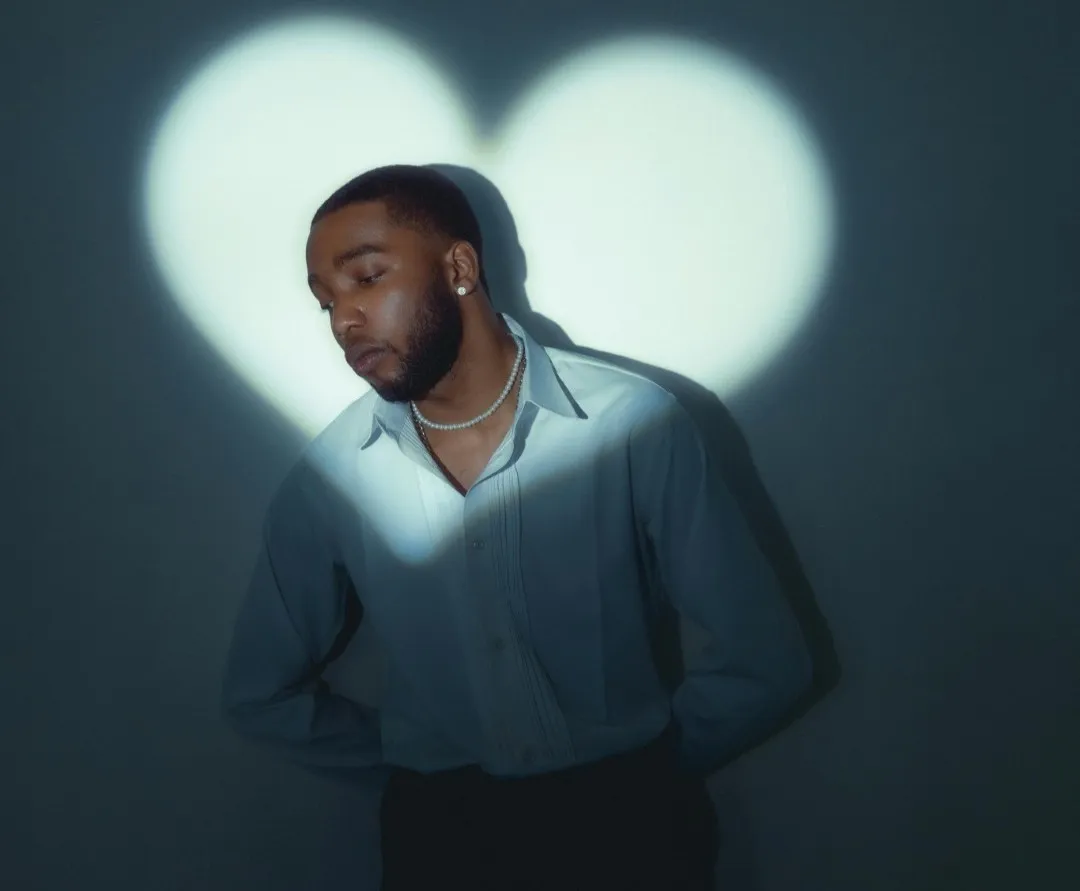
Try the Vintage CRT EffectBefore — original photo
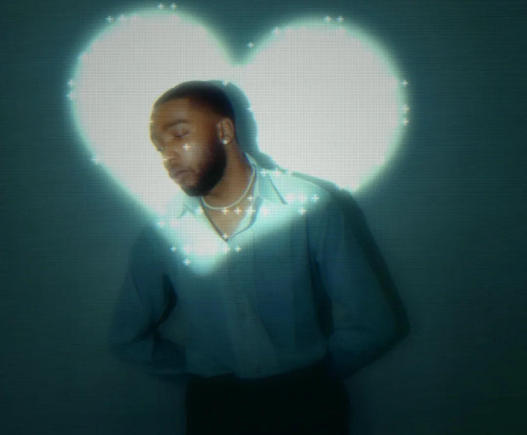
After — Vintage CRT screen look
The Short Answer
A VHS effect imitates damage that happened while the image was being recorded and replayed on magnetic tape. A CRT effect imitates how a glass tube screen physically painted that image in front of you.
In practice, VHS is about degradation and CRT is about presentation. A VHS look takes information away: colour accuracy, resolution, edge definition. A CRT look adds a layer on top: lines, glow, curvature, a faint sense that you are looking at hardware rather than at a photo.
That is why the two effects fail in different ways. Push VHS too far and your photo becomes unreadable. Push CRT too far and your photo becomes a striped pattern. Knowing which one you actually want saves a lot of slider guessing.
What a VHS Photo Effect Actually Simulates
VHS was a consumer tape format built around compromise. The luminance and colour signals were stored separately, colour was recorded at a much lower bandwidth than brightness, and every copy or rewind wore the tape down a little more. A convincing VHS photo effect recreates those specific compromises.
- Chroma smear and colour bleed — colour spilling sideways past the edges it belongs to, most obvious on reds and bright saturated areas.
- Tracking lines and dropouts — horizontal bands of noise or white streaks rolling through the frame where the tape and head lost contact.
- Genuine resolution loss — VHS resolved far less horizontal detail than any modern camera, so fine texture simply is not there.
- Tape wobble and jitter — slight horizontal instability that makes vertical edges look nervous.
- Camcorder furniture — timestamps, REC indicators and battery icons burned into the corner. These are not tape artifacts at all, but they read as VHS instantly.
Notice how much of that is about loss and instability. A VHS edit is convincing when it looks like the image survived something, not when it looks like a filter was placed neatly on top.
What a CRT Photo Effect Actually Simulates
A cathode ray tube fired an electron beam at a phosphor coating, sweeping across the screen one line at a time. Everything we recognise as "retro screen" comes from that physical process.
- Scan lines — the visible gaps between the lines the beam drew, and the single most recognisable CRT signature.
- Phosphor glow — a soft bloom around bright areas, because lit phosphor spread light into its neighbours.
- Screen curvature — a gentle barrel bow, since the tube itself was curved glass.
- RGB misalignment — thin coloured fringes on high-contrast edges where the three colour beams never landed perfectly.
- Corner falloff — brightness fading toward the edges, plus a general feeling of a frame around the picture.
Unlike VHS, a CRT effect does not need to damage your subject. The underlying photo stays intact underneath; you are adding the screen it is being viewed on. That is why CRT looks tend to survive Instagram compression and small thumbnails much better.
If you want the step-by-step version of this, the vintage CRT effect guide walks through each control and recommended starting values.
VHS vs CRT: Side-by-Side Comparison
| Aspect | VHS tape effect | CRT screen effect |
|---|---|---|
| What it simulates | Magnetic videotape recording and playback | A cathode ray tube screen drawing the image line by line |
| Signature artifacts | Tracking lines, chroma smear, dropout streaks, tape wobble, timestamp overlays | Horizontal scan lines, phosphor glow, screen curvature, RGB misalignment, vignette |
| Colour behaviour | Washed out and shifted, with colour bleeding beyond edges | Punchy contrast with glowing highlights and slight channel fringing |
| Detail and sharpness | Genuinely low resolution: smeared edges and lost fine detail | Soft but structured: detail is interrupted by lines, not erased |
| Text legibility | Often destroyed, especially small type | Usually preserved if glow and line intensity stay moderate |
| Best suited to | Found footage, camcorder nostalgia, lo-fi music visuals, 90s home video moods | Retro TV and monitor looks, Y2K, vaporwave, gaming and interface art |
| Era it evokes | Roughly 1980 to 1999, home recording culture | Roughly 1970 to 2005, TVs, arcades and early computers |
| In DreamyGlow | Not simulated as a full tape pipeline | Vintage CRT effect with intensity, scan line density and curvature controls |
Why the Two Get Confused
The confusion is historical, not careless. Nobody watched a VHS tape on a flat panel: tapes were played through CRT televisions. Every memory of a rented movie or a family camcorder recording arrives bundled with scan lines and phosphor glow, because the tape and the tube were always experienced together.
So when someone asks for a "VHS filter", they are often describing the whole memory: soft washed colours seen through a glowing, curved screen. Splitting that memory into its two halves is useful because you can then choose how much of each you want.
There is also a practical reason to separate them. Tape degradation is destructive and hard to control, while the screen layer is additive and predictable. If you only have budget for one effect, the screen layer carries far more of the nostalgic signal per unit of damage.
Which One Should You Use?
Choose a VHS look when the story is the recording
If the point of the image is that it was captured badly, on cheap equipment, a long time ago, tape artifacts do the work. Think fake found footage, mock camcorder stills, horror aesthetics, lo-fi album art or anything where you want the viewer to feel they are seeing evidence rather than a photo.
Accept the cost: faces get softer, small text disappears, and colour accuracy is gone. If those matter to your image, VHS is the wrong tool.
Choose a CRT look when the story is the screen
If you want the viewer to feel they are looking at a monitor, an arcade cabinet, an old TV or a Y2K interface, the CRT layer is what sells it. Vaporwave and synthwave visuals, gaming art, retro-futuristic posters, glitchy tech branding and neon night photography all read better with a screen layer than with tape damage.
This is also the safer choice for anything commercial. Your subject, logo and typography stay recognisable, which matters when the image has a job to do.
Use both when you want a full 90s memory
Stacking is legitimate and historically accurate. Apply the tape-style degradation first — soften detail, wash out and bleed the colour, add noise — then add the screen layer on top with scan lines, glow and curvature.
Keep both layers weaker than you would use alone. Two moderate effects stack into one strong effect very fast, and the combination is where most retro edits tip over into unreadable.
Where DreamyGlow’s Vintage CRT Effect Fits
DreamyGlow’s Vintage CRT effect deliberately targets the CRT screen look rather than a full VHS tape simulation. It builds the display side of the aesthetic: scan lines, phosphor-style glow, CRT colour shift and subtle screen curvature, with controls for intensity, scan line density and curvature.
What it does not do is emulate a tape transport. There are no generated tracking errors, no head-switching noise at the bottom of the frame, no dropout streaks and no camcorder timestamp overlays. If you specifically need those, you are looking for a dedicated VHS pipeline, not a CRT filter.
For most retro projects that limitation is not a problem, because the screen look is the part people recognise instantly. Raising intensity gives you a warmer, more degraded and more obviously analog result that reads as "old video" to most viewers, even though the mechanism is a screen rather than a tape.
Practical starting points: 40 to 60% intensity for portraits where the face still needs to read, 70 to 90% for bold social posts and music artwork, and 30 to 50% for interfaces, screenshots or anything containing text. You can compare it against the other looks on the effects overview if you are still deciding.
Mistakes That Give Away a Fake Retro Edit
Most unconvincing retro edits fail for the same handful of reasons.
- Perfectly sharp source under heavy artifacts — razor-sharp modern detail visible through supposedly degraded tape reads as fake. Soften slightly before you degrade.
- Scan lines at the wrong scale — lines that are too thick or too widely spaced look like a stripe pattern instead of a screen. Scale line density to the output size.
- Glow with no contrast left — if bloom eats your highlights, add contrast back so blacks stay deep. Real CRTs were punchy, not flat and grey.
- Extreme curvature — a slight bow reads as hardware, a strong bow reads as a fisheye lens.
- Timestamp overlays on a CRT-only edit — a camcorder date stamp implies tape. Mixing signals without the matching artifacts makes the edit feel assembled from stickers.
- Ignoring the final viewing size — an effect tuned at 100% zoom often vanishes or turns to noise in a feed. Check your export at the size people will actually see.
Frequently Asked Questions
Pick the Artifact That Matches Your Story
VHS and CRT are not competing filters, they are two different stages of the same nostalgic chain: tape recorded the image, the tube displayed it. Decide whether your photo should look recorded or displayed, and the settings stop being guesswork.
For most creators the screen look is the faster win. It adds unmistakable retro character while keeping faces, logos and text readable, and it holds up at the small sizes where your work is usually seen.
Try the retro screen look on your photo
Upload an image, apply the Vintage CRT effect and adjust intensity, scan lines and curvature until it feels right. No a free watermarked preview, or $1.99 for full-resolution.